

With 35 years of playing and 10+ years coaching, it’s pretty obvious that Josh Shore (founder and owner) is passionate about baseball.
When the club he coached for decided to cut ties with a logistics provider that fell well short of the core values 108 was built from, they asked him to build something better. And he did—from scratch. Budgets, balance sheets, timelines, team portals, reporting systems—everything teams needed but didn’t have.
108 Logistics handles the operations behind the scenes for youth baseball clubs so coaches, parents, and athletes can stay focused on performance. From organizing tournament travel to managing schedules, flights, hotels, rental cars, and team communication—108 Logistics brings pro-level logistics to clubs across Seattle.
With over 20 years of decorated experience in retail banking, Josh brings a unique intersection of financial expertise and passion for America's pastime. His deep understanding of sustainable financial management has made him a leading provider for the youth baseball community, ensuring this cherished tradition continues to serve as a cornerstone of youth development for generations to come.
What's the PARADOX?
What's the PARADOX?

Making the brand
How to connect with baseball culture while commanding business respect
OUR TASK
-

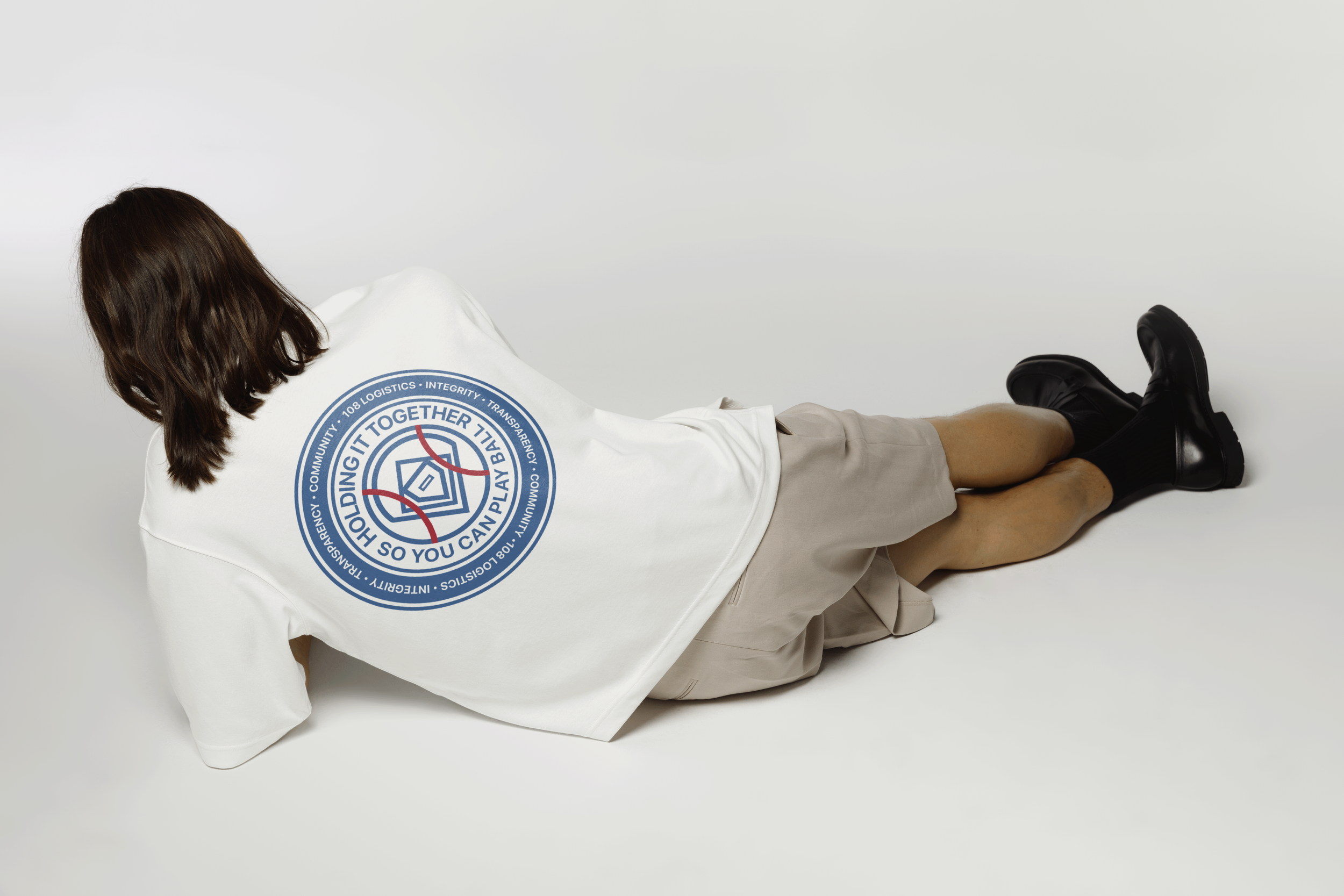
To be the stitches holding the team together
Without the stitches, there is no baseball. Josh doesn’t consider himself a service provider, but a trusted partner, advisor, and team player. He requested we find a way to work this metaphor into the key messaging and brand identity.
-

More baseball than finance
Josh requested his identity be “very obviously baseball”, presented in a design style while also evoking baseball nostalgia. Our task was balancing this consideration with typical visual cues associated with finance brands.
-

A deep desire to preserve an American past time
When clubs have access to dependable financial support, they can focus on growing and serving their communities without stress. Team sports are a training ground for stable, well rounded adults. They’re worth protecting as a cornerstone of community life.
Archetype: The Ruler
Pssst - we used my Archetype Clarity Guide for this project! Sharing it here in case you resonate with 108 Logistics’ archetype.
The Ruler’s Mantra: "Chaos is a choice".
108 Logistics audience (baseball club owners, coaches, managers, and parent volunteers) all shared a common fear: the overwhelm of administrative tasks and chaos pulling them away from what they love—developing players and playing ball.
We considered the possibility of other archetypes, but ultimately, The Ruler was a better choice because it spoke directly to 108L’s clients desire to create and maintain perfect order within their baseball operations.108 Logistics also didn’t want to be perceived as just as advisors or consultants, they wanted to be known for their high touch service as the operational backbone that clubs needed. The Ruler executes and maintains order - a crucial distinction for a service that handles day-to-day financial operations.
Pssst - we used my Archetype Clarity Guide for this project! Sharing it here in case you resonate with 108 Logistics’ archetype.
Make it stand out
We seamlessly brought the brand to life IRL with business cards featuring tactile, raised spot gloss “stitches”.
Traditional sports branding follows a typical formula: mascots, swooshes and swashes, “Varsity” fonts, and stylized cursive. We threw all of that out the window and started instead with what exemplifies Josh has the genius behind 108 Logistics.

An imagining of what a branded client portal could look like for 108 Logistics.
108 Logistics takes pride in their penny-to-penny precision, and we translated that preciseness into a distinctive reimagining of classic baseball elements. The clean, geometric forms arranged mathematically reflects the Ruler’s desire for structure and order, while remaining very obviously baseball.
Josh envisioned 108 Logistics as "the stitches holding the baseball organization together," understanding that lasting partnerships, not just flawless execution, create truly sustainable success. We represented this through the red lines, holding the game together snugly.
The submark features 108 Logistics’ top values: integrity, transparency, and community.

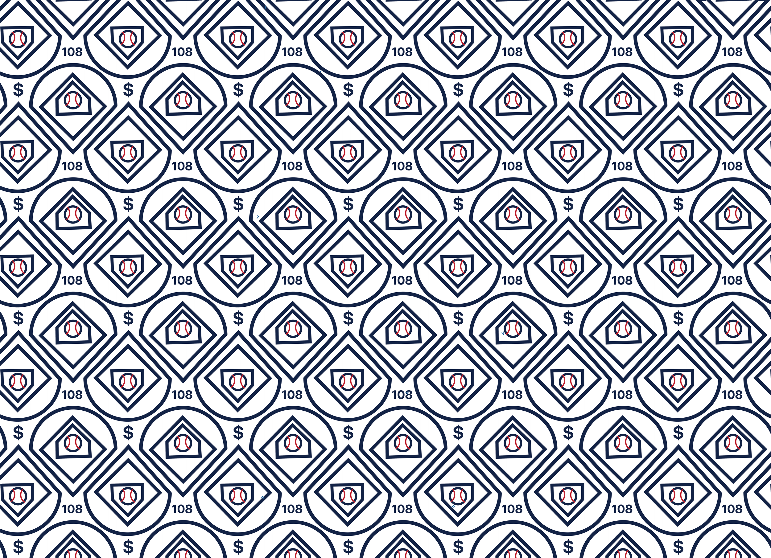
We used the brand pattern as an opportunity to speak to the finance aspect of the brand. This made great background fill for website design.
The Result
To bring 108 Logistics' brand strategy to life digitally, we partnered with our preferred web development partner, Akiha Marketing. This collaboration ensured seamless translation of The Ruler archetype and 'stitches' metaphor into a functional, professional website that speaks authentically to both baseball culture and business needs.


